
An effective solution for oral radiology training
Conventional radiography education requires students’ exposure to hazardous radiation. ORPS(Oral Radiology Practice Simulation)/RS is an educational VR application to solve the problem. This app provides more safe and effective training of oral radiology for dentistry trainees and educators. As a designer, I spent six months working on this project with my team at VRAD and helped launch it in early 2017.
Role UX, UI, Visual, Motion
Time Launched in 2017
Produced by VRAD
Tool HTC VIVE, Unreal Engine, Illustrator, Maya, Perception Neuron
Goals
The goal for the project was creating an application that helps dental students to learn better Dental Radiology over their current practicing problems such as radiation exposure and regulations. Through immersive technologies, we wanted to make the training experience that is more safe and easy to study regardless of time or space at a lower cost. I worked on Interaction design, which focused on a good learning experience for dental students.

Process

Understanding
I joined this project when the app was in early mockup stage. As the first interaction designer in my team, my task was to design visual and interactions for users. I started from understanding the current app and what is my team’s needs. Thanks to a researcher in my team, I could learn more about the dental radiology, its conventional process, and problems. After that, I tried early mockups and learned the previous working process with the engineer team. From many team meetings and research, I learned what my team’s and users’ needs. This process helped me to set my design goal for the app.
Challenge
After I tried the early prototype and had conversations with my team, I found a few problems. The biggest problem was that the app was not user-friendly. The team was mostly made up of engineers, and the app focused a lot on technology. I loved my team’s tech and goal, but we found that the app should be easier for users. Here are the top five problems which I worked on.
UX
1. Not completed onboarding
2. Not intuitive interaction
UI
3. Complex interface with complex information
VISUAL
4. Inconsistent visual language
5. Not enough learning assets
Solution
1. Not completed onboarding
-> Redesign onboarding considering user proficiency levels
First of all, there wasn’t enough onboarding for people who are not familiar with VR. This was the old user journey. There was a tutorial only about the application.
Before
But many users even couldn’t start the app, because they were new to VR and didn’t know how to use controllers. We developed a tutorial from critical parts of precautions for VR and the application to make sure users understood the important parts like how to use the controller and how to interact with UI.
After

2. Not intuitive interaction
-> Clear user interaction
And the other problem was that there was a lot of unnecessary stuff that was added into the flows. The old prototype asked users too many useless movements which are called teleportation in VR. Most of these movements were not essential in being able to complete the task. Therefore, we decided to remove useless interactions for a straightforward learning experience. For example, the training part has four key user flow; 1 setting options 2 setting X-ray camera 3 taking an X-ray 4 confirming the result. Users had to teleport to go each spot, but we changed like under the image which doesn’t need useless interaction.
Before


Before (to see the outcome, user had to teleport a lot)
After

After (now, user can see the outcome right away)

3. Complex interface with complex information
-> Intuitive UI
For oral radiology training, students had to choose many options such as patient type like age and gender, which part of tooth they are going to take a picture of, and what types of films and shooting methods they are going to use. From the old UI, We found that users couldn’t know which part they chose right away unless they open the options again.
Before

Text based, Multi-level dropdowns
After

Visual information, One screen
One of the biggest challenges for UI was to simplify and include all of them at the same time. Researcher and I started organizing the information by considering its hierarchy. And then, I visualized them thinking how users can understand the information better. To make a clear chart design with all the options, we divided three sections and classified them by hierarchical orders. And then, I added visual information, which shows the visual part of user’s literal choice. Now, students can know which part they are shooting right away.


4. Inconsistent visual language
-> Consistent design system
The fourth problem was that the visual design was not consistent and was not beneficial for learning experience. For visual design, I worked on creating design system and language to have consistent design patterns and to make it beneficial for everybody who uses the app. The design concept for menu and radiology options was a medical/dental chart which dentist use in the real world with X-ray textures.
Before

After


5. Not enough learning assets
-> Enough assets for learning
(1) Patients
After the main design system was set, I started to think about how users can have better learning experience and enjoy it. In the old prototype, the team used a dummy patient character. I thought we need to develop our own various characters not only for copyright but also for better learning experience, which was our main purpose. Dental students will meet different patients in age or gender in the real world and also had to learn many tooth types.
Before

To accommodate these needs, we decided to create various patient characters and their animations. For characters, I suggested variation in age, gender, and race at the first time. However, after conversation with my team members, I found that we need to optimize the app with our timeline. So we agreed to start from making a family and develop more variation in later versions. I created characters using iclone and used Maya and Perception Neuron(motion tracking app) for their animation. And then, I integrated them with Unreal engine. It was really fun to learn motion tracking and explore various people’s movements.
After
(2) Visual information
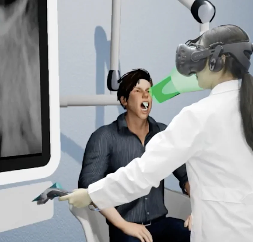
We also added visual information to help users have better training experience. For example, students can know how to set the X-ray camera following the silhouette of the camera and colors.


User Test
We met many dental students and professors in their universities and conducted several user tests. Thanks to this process and user’s data, we could select a better design option among several design versions. Also, we could know the user’s needs and improve our app based on them. According to new user tests, the changed interaction and visuals helped users to understand the process easily and make their decision faster without confusion.


What I learned
The entire six months of creating this app with new technologies were very intensive. But in the end, it was so meaningful to me, because I learned something new every day from the challenges, users, and team.
Especially because my team members were mostly engineers and it was a small team, I could learn technical implementation from design to engineering. To communicate with engineers better, I learned how to convert my designs into codes that engineers could better understand and utilize. This experience helped me see things from their perspective and be a better communicator. It also helped better equip me for my future interaction and motion projects with programmers.
After seeing the dental students’ improvements in their practice using this app, I learned that combining design and immersive technology can create a really powerful learning experience. I believe that these experiences like how to approach design in new technology, and how to use the technology for better experience, empowered me to design in a fast-paced environment with emerging technologies.

