Mcard is a concept app to solve problems of the NYC MetroCard. Link your phone and enjoy New York!
This is a case study to enhance NYC transportation experience with MetroCard in 2015 (when it didn’t have a tap to pay system). I started from competitive analysis on the subject and user research. After learning the subject, developed solution ideas that included wireframes, user flow, prototypes (Paper, InVision), and visual design.
Role Concept, Research, Interaction, Visual, Motion
Time 2015
Tool Sketch, Photoshop, Illustrator, After Effects, InVision
Process
Mcard_Process_Gallery


Understanding
People use MetroCard as a payment method for subways and buses in New York City. Based on competitive analysis on the subject and user research, I found that many people have bad experiences when using it, like the example below.


Problem
According to the user research, the main complaints about the MetroCard were (1)complex steps to refill it and track the balance (2)MTA machines do not read the card well. The MetroCard is problematic from the beginning to end.

Solution
Based on the complaints. I came up with a solution; an application that can end the vicious circle of the NYC MetroCard.

Ideate
After setting a goal to make an all-in-one application that is easy to use for people, I started to think about how to create it.

Tech
I decided to use microchip technology because many people already have it in their phones or credit cards. They do not need to purchase new things. Also, it is easy to use and manage. (Users can take subway by just tapping phone/card and refill balance with linked app.)

Design
The goal was to design intuitive experience which people can use easily and enjoy with New York’s representative color.
*Microchip is an integrated circuit and small programmable logic/memory device. There are various types for different functions. It is already being used in credit cards (e.g. MasterCard, Visa) and Near-Field Communication (NFC). The technologies enable contactless payment, as well as allow data to be read by compatible machines such as mobile phones.
Sketch
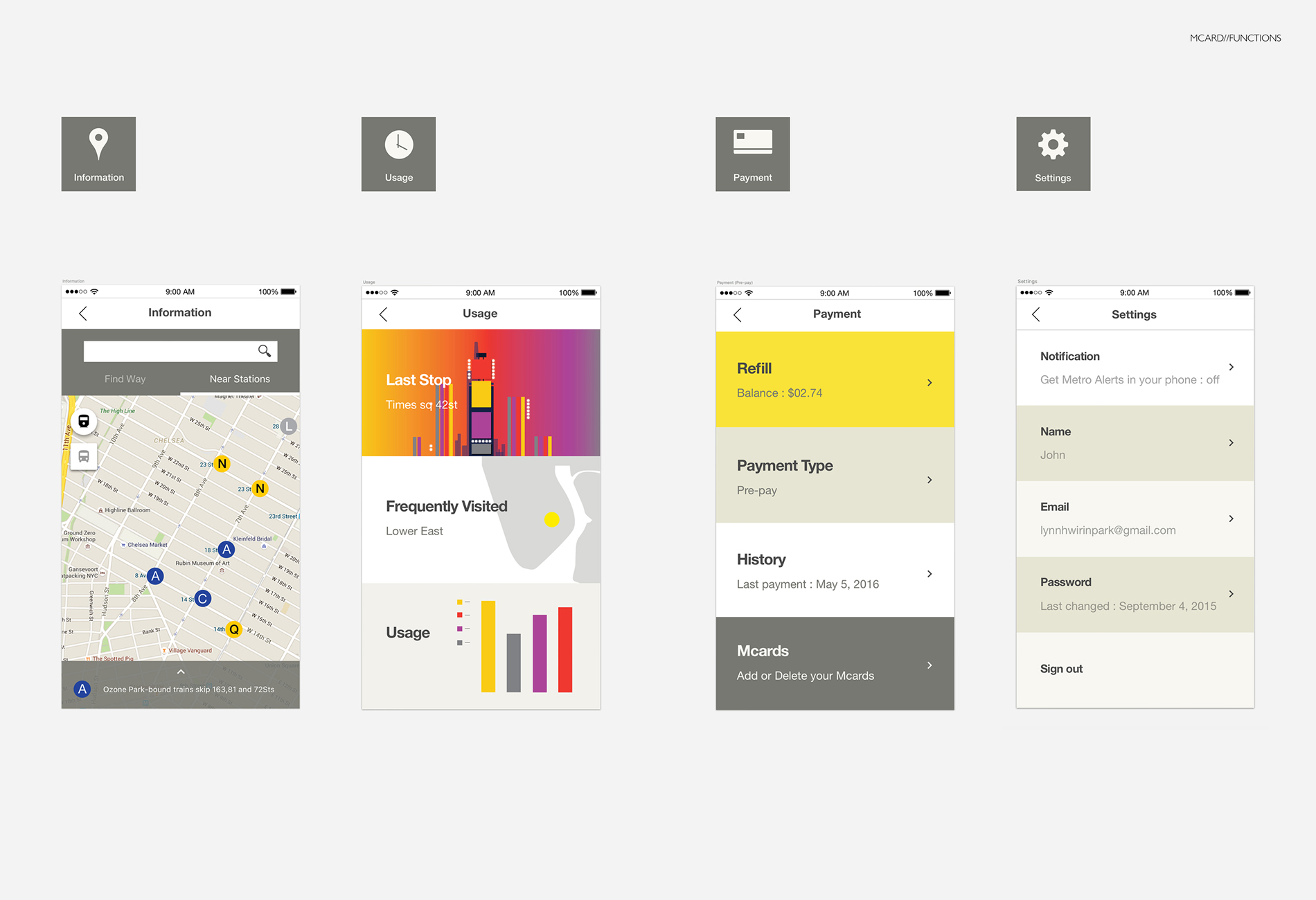
I divided three main steps (start, use, manage) and sketched ideas of four functions (payment, information, usage, settings) for the new app.
Design

Onboarding

Architecture

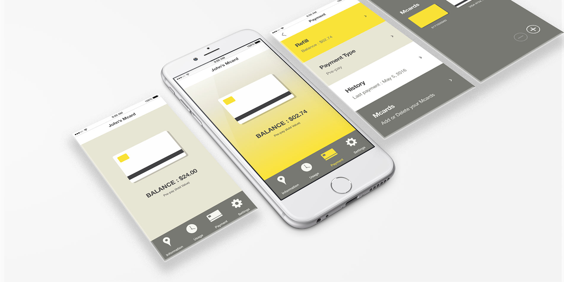
Main Screens
Users can check their balance anytime on the main screen. I used MetroCards' representative color (yellow) as a highlight to make users focus.

Refill
When the balance is lower than $2.75 (a subway, bus fare), the users will see a yellow screen with a refill icon. If users do not want to refill it every time, they can choose their payment type to Pay-as-you-go with their linked credit cards.

Functions
Delighting users
After several user tests and iterations, I received feedback that the app was easy to use. However, that was all. I realized that this app could be applied anywhere. I decided to design something more to represent New York and make people feel delightful when they use this app. New York has various subway stations with attractions, history, and stories. It would be great to design them with little surprises for users. These are some screens when users tap their phones on each station to pass turnstiles. Every station will interact with users by customizing the app to the station's design and look-and-feel.

Prototype
Pre-pay users
Pay as you go users
What I learned
Through overall UX process, I learned various methods to solve a problem. My favorite part of the process was working with the users and getting direct feedback which helps to develop a better product. I love to see how a product changes based on users’ feedback, and then how the changed product affects users.
Next Steps
This project was from 2015, and I found that NYC subways are going to change their old payment system to tap-to-ride turnstiles from late 2018. It is great to know that they are really improving (and they finally added tap and go system in 2020 - 2022). If this Mcard app can be launched in real, I would like to develop its user experience to enable people to understand new NYC Metro payment system easily, NYC Metro system's brand, and delightful interactions for users. Also, we should develop the system step by step considering other users who don’t or can’t have smartphones and credit cards.
